The Brief
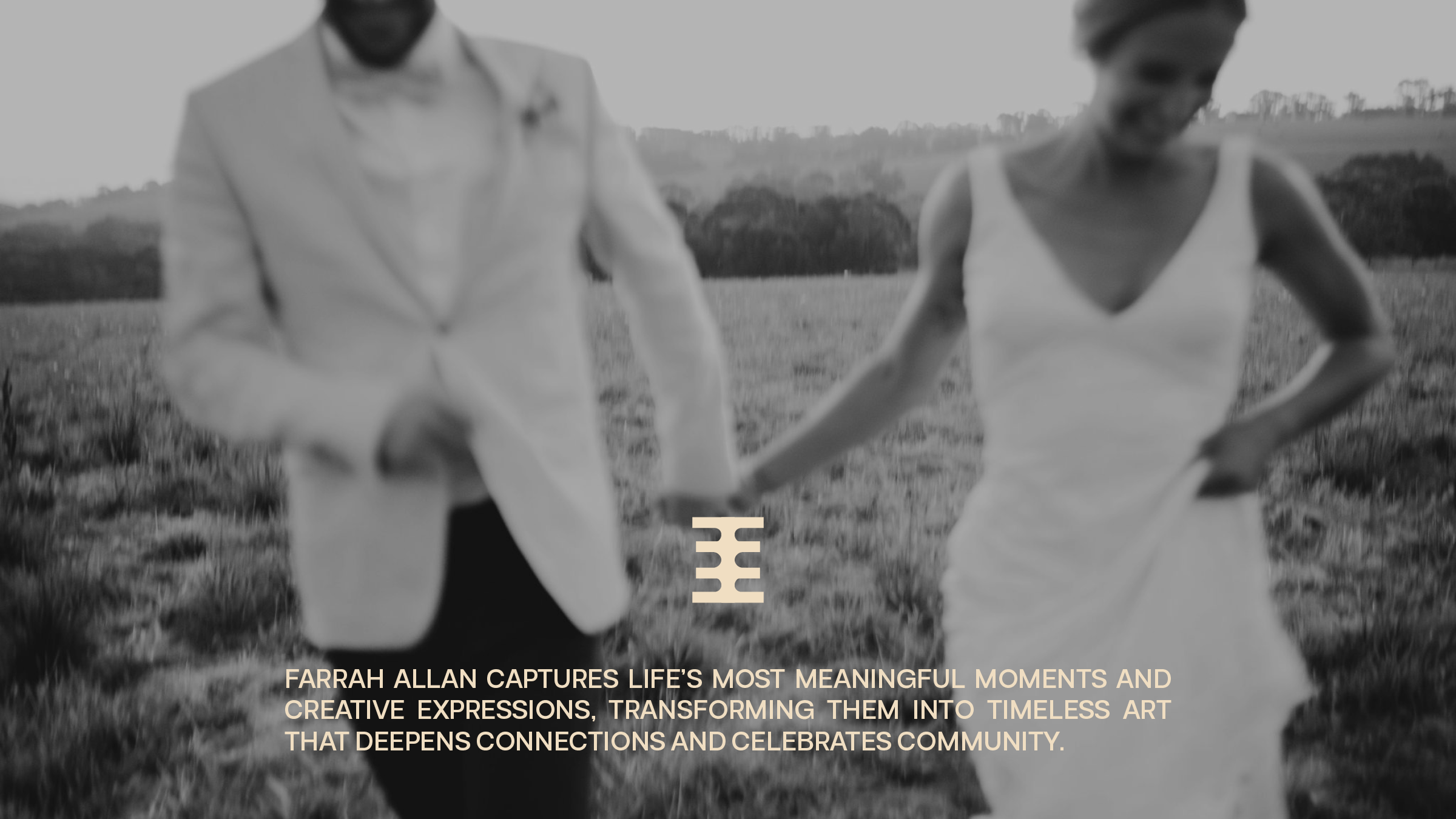
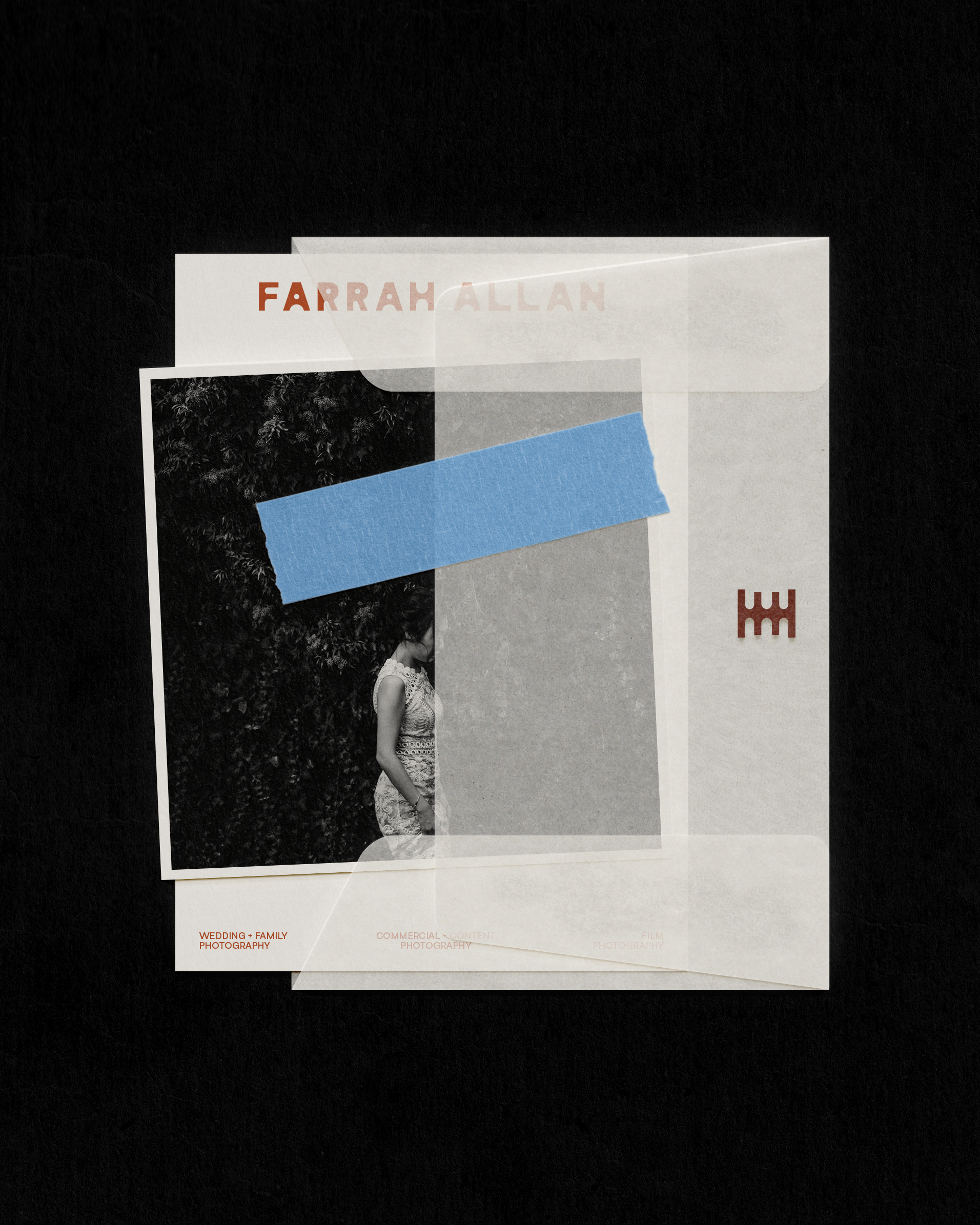
Farrah Allan is a photographer whose work spans weddings, families, and commercial content. While her craft and artistry were undeniable, her previous brand lacked distinction—blending into a sea of sameness in an oversaturated industry. The goal was to create a brand that reflected her deep passion for the artform, her fine-art eye, and the heartfelt, human essence that defines her work.
Creative Direction
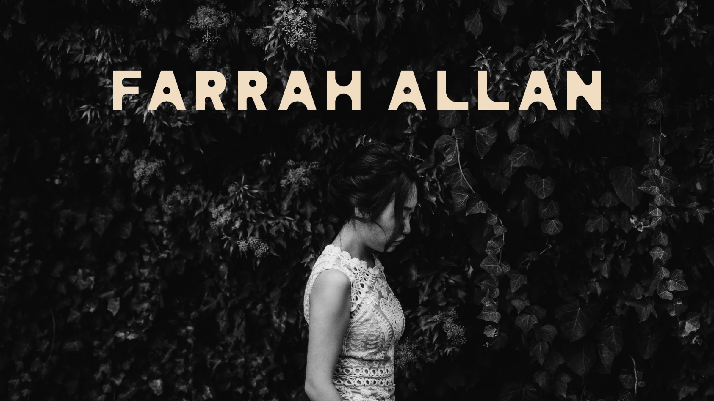
The process began with uncovering what makes Farrah’s approach truly her own—a deep love of photography as art, not merely documentation. Her fascination with architecture, form, and the play of light and shadow became a central thread, alongside her appreciation for film as a medium that captures rawness and truth.
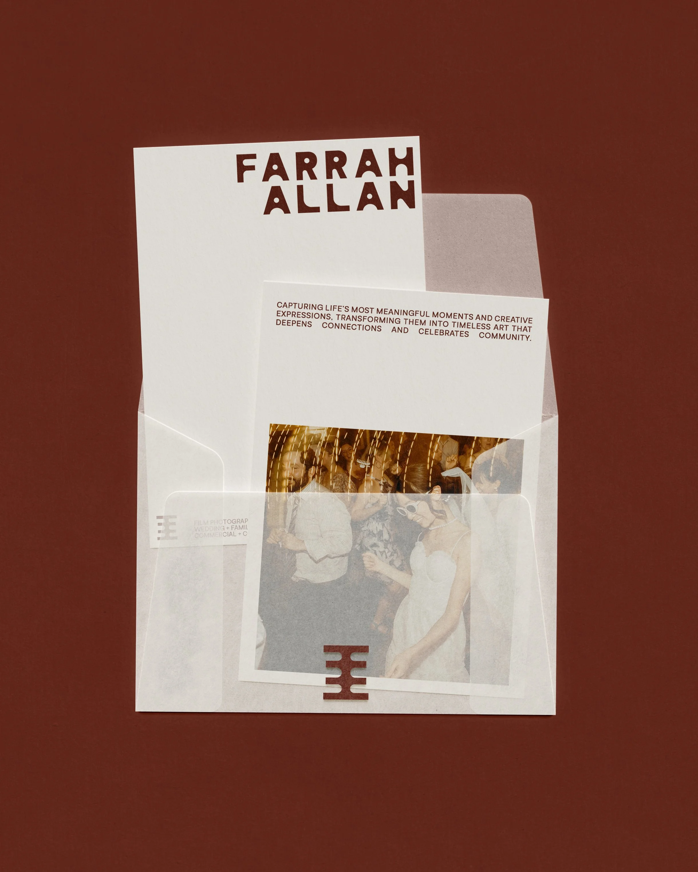
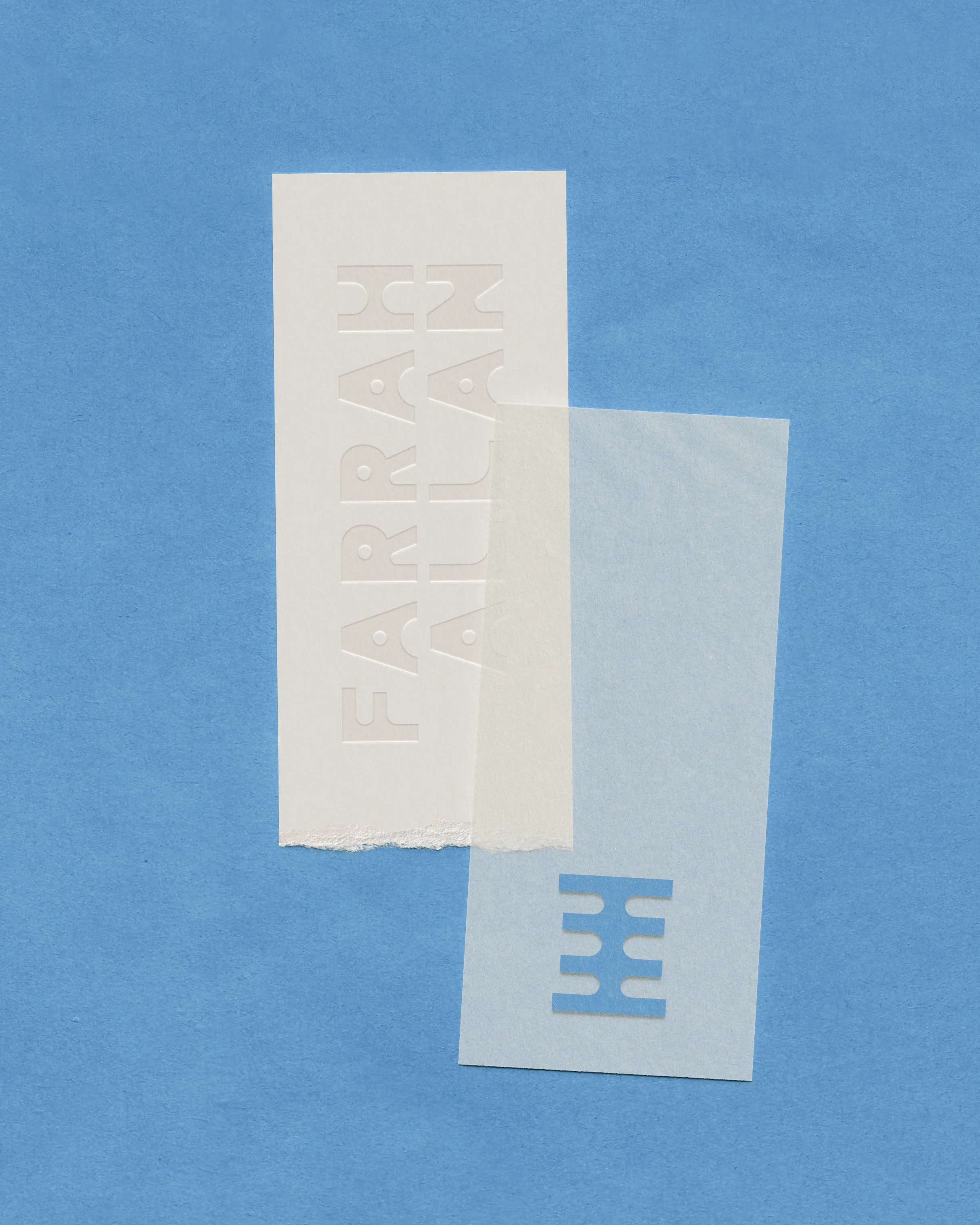
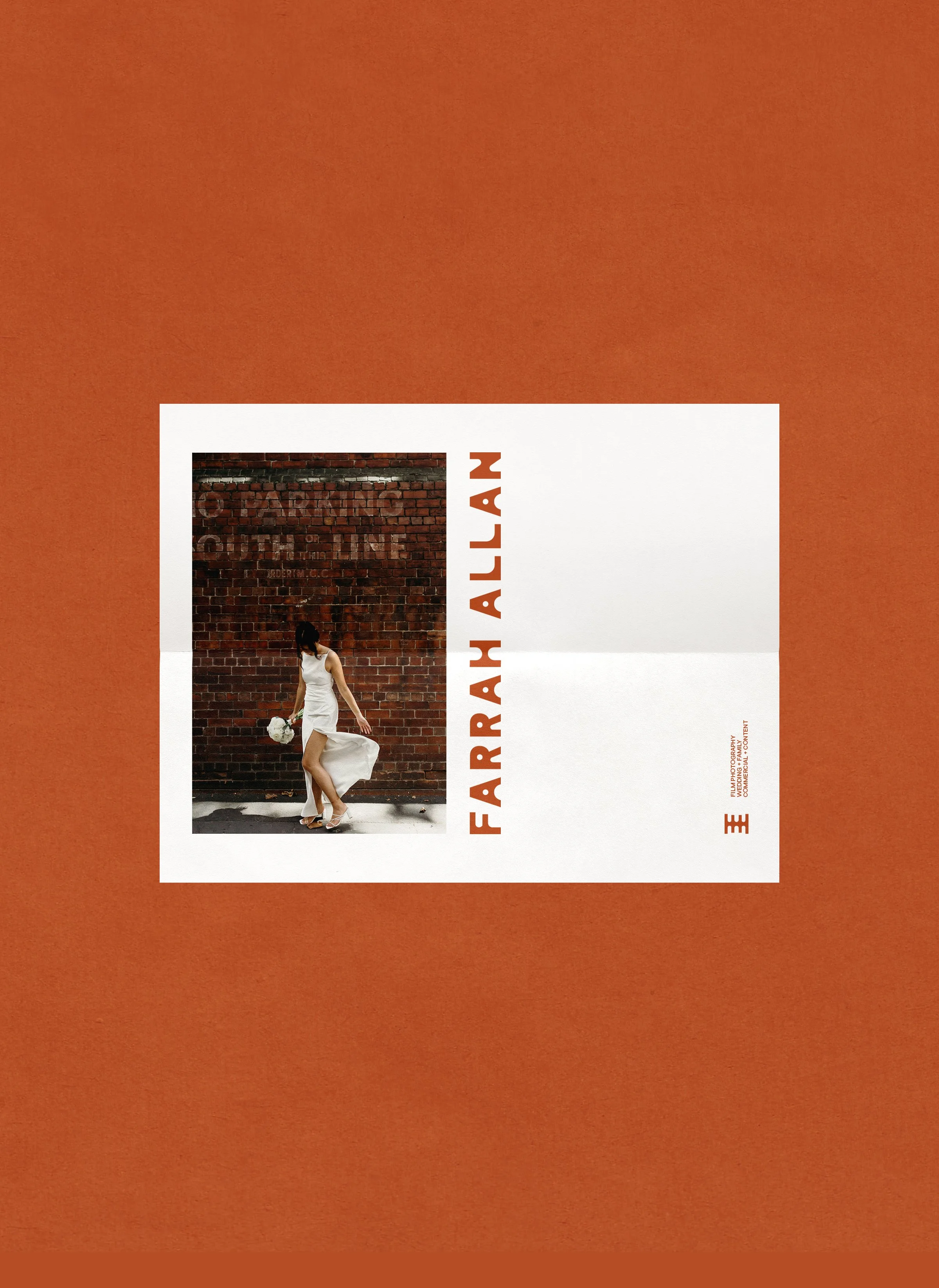
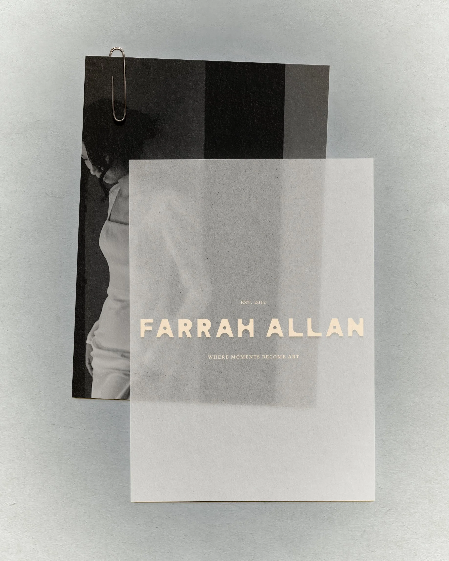
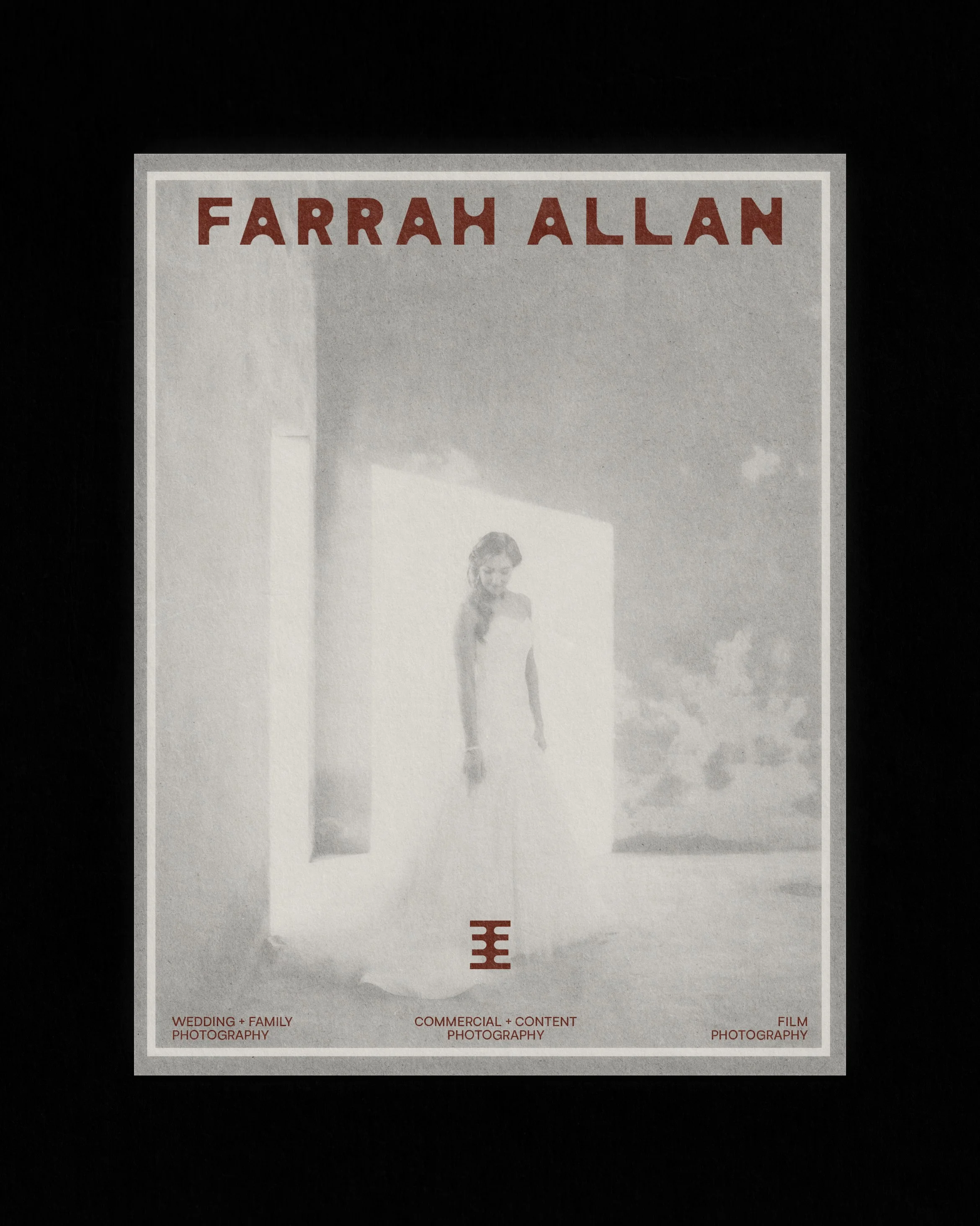
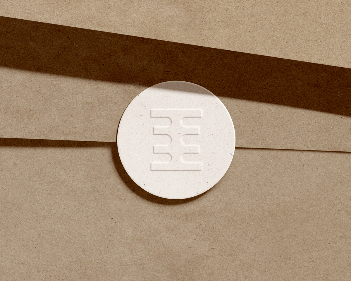
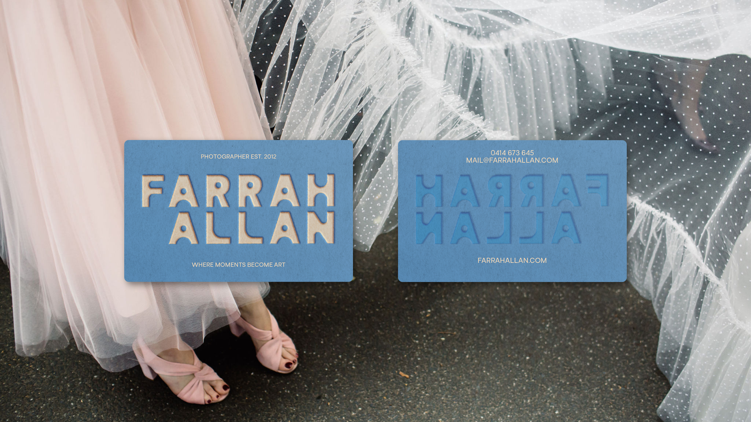
These insights led to a creative direction inspired by brutalist and Bauhaus design — clean, intentional, and full of quiet strength. The resulting logo system balances structure with warmth: bold geometric forms softened by refined details, mirroring the interplay between precision and emotion that defines Farrah’s imagery.
The brand strategy and visual identity were designed to bring clarity and confidence to her creative presence—grounded in her values of authenticity, artistry, and connection.
Deliverables
The brand rollout included:
• Brand strategy framework
• Visual identity design
• Logo suite
• Colour palette
• Typography system
Every element was created to reflect the timeless, fine-art nature of her photography while giving her a distinct, elevated visual foundation for future growth.
Farrah Allan
Case Study—