
The Ante
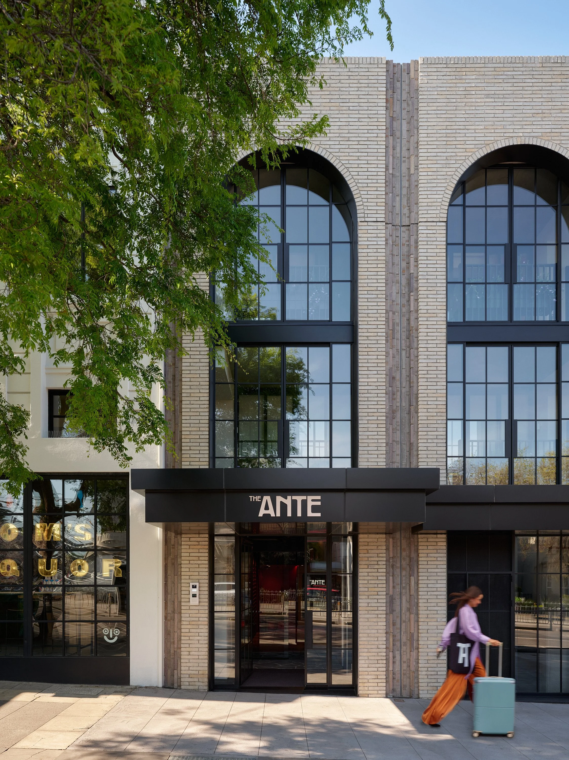
The Ante, a nine-room boutique hotel at 101 Fitzroy Street, St Kilda, where no two rooms are the same. Brand strategy, visual identity, collateral, signage and nine original artworks, all built from a single idea.
Challenge
The Ante arrived with a heritage building, a finished fit-out and no brand. The interiors drew on St Kilda’s rock’n’roll history: wild carpet beside stainless steel, coloured grout in plain tiles. The brand had to belong to those rooms, not sit politely beside them. And it had to avoid the copy-paste calm of so many boutique hotels.
The difficulty was balance. Too polished, and The Ante becomes another tasteful hotel. Too wild, and it stops feeling like somewhere to rest. The brand had to hold both at once.
Creative Direction
The answer was to stop choosing. Push-Pull became the organising idea. The Ante doesn’t sit at either end of the spectrum; it lives in the confident middle, where elevated and wild, polished and playful, are allowed to coexist. The tension isn’t a problem to resolve. It is the design.
Push-Pull was set in the brand strategy, with the interior designer in the room from the first workshop. That way the interiors and the identity grew from the same thinking, rather than one decorating the other. From there, every element had to pass the same test: where is the restraint, and where is the release?
Services included:
Brand Strategy
Naming
Visual Identity
Collateral
Signage
Commissioned Artwork
Print Management
Photography Art Direction
Credits:
Photography: Lucas Allen
Architecture: Warren and Mahoney
Interior Design: Brittany Pearce and Debra Longin
Mural: Daniel Hill


Execution
The wordmark pairs clean, considered letterforms with curves that echo the arches of the heritage building. The palette sets grounded, deep tones against moments of bright colour, used sparingly so they land. The pattern system plays the wild carpet to the typography’s stainless steel. In layout, elements push to the edge of the page, and something always answers from the opposite side.
The iconography is ten restrained, monochrome line icons drawn from the neighbourhood: tide, palm, transit, nightfall, sound. They’re quiet enough to sit beside the pattern without competing. The voice follows the same rhythm, polished but never too serious. In two-line copy, the first line pushes and the second pulls back.
The system carries through postcards, notepads, pens, totes, social templates, building signage and room numbers.
The artwork is where Push-Pull is most visible. There are nine original works with a Bauhaus and Art Deco sensibility, rendered mostly in black and white to counterbalance the patterns already in each room. Each holds a single pop of colour, set against that room’s scheme rather than matched to it, so every room feels distinct while still belonging to the same hotel. The subjects are St Kilda’s buildings and landmarks, deliberately avoiding the postcard icons. Explore the neighbourhood, and you might spot the building that’s hanging in your room. The nine originals extend across twenty pieces through colourway variations.
Outcomes
The Ante reads as one brand, from the canopy on Fitzroy Street to the notepad by the bed. The interiors and the identity feel designed by the same hand, because they were built from the same idea.


