Case Study—
Yo-Chi: New Açaí Campaign
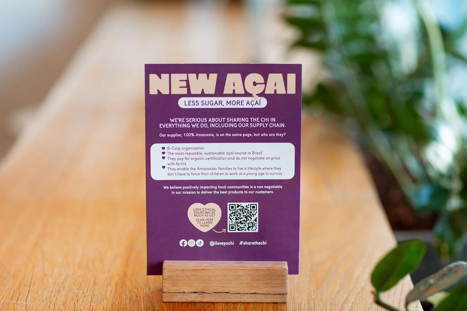
The Brief
Yo-Chi was introducing a new, improved açaí recipe with 50% less sugar — a significant product update that needed bold, high-impact national visibility. While açaí was already a popular menu item, this healthier twist presented an opportunity to reach new customers and re-engage loyal ones. The brief was clear: create something clean, eye-catching, and long-lasting that would stand out in-store and across multiple channels.
Creative Direction
The campaign’s tagline — “Less sugar, more açaí” — inspired the entire visual direction. I interpreted this as a cue for less visual clutter and more product hero. The result: bold, close-up swirls of açaí became the central graphic language, paired with oversized, confident typography in Yo-Chi’s açaí signature purple hues. The aesthetic was intentionally graphic-led, with a design system built for flexibility, recognition, and longevity.
Deliverables
This national campaign rolled out across a wide suite of collateral, including:
Window decals
A-frames
Table talkers & strut cards
Staff badges
Vehicle graphics for a branded giveaway car (a new Hyundai Inster)
The visual system was designed to be both adaptable and cohesive — creating a consistent look and feel from stores to street-level activations.
Photography: Farrah Allan


Campaign Integration
Alongside the product launch, Yo-Chi ran a national competition to drive engagement and trial — encouraging customers to try the new açaí and post on TikTok or Instagram for a chance to win a new car. While the giveaway didn’t drive the creative, supporting visuals were developed to integrate it seamlessly into the broader campaign.
Results & Impact
The campaign was an overwhelming success. Stores in multiple states ran out of stock due to the surge in demand for the new açaí recipe — a clear indicator that the product and campaign messaging had landed strongly with customers.
The creative direction was praised for its clarity and standout appeal. Internally, the team noted how the bold heading lockup and consistent visual system enabled them to communicate clearly across all channels — from in-store signage to digital marketing and even vehicle branding.
One of the highlights was the campaign’s versatility across mediums. The visual system was easily adapted across various formats while retaining its impact and brand consistency — a true test of its strength. It became instantly recognisable and cohesive, without feeling repetitive.